Japanese Ecommerce Website
GoSentaku
Product Design | 2025

Background
Exon is an e-commerce company specializing in digital products that deliver tailored product recommendations across multiple categories. Our mission is to help users make confident purchasing decisions by providing all the information they need in one place.
As part of our growth strategy, we identified an opportunity to strengthen our presence in the Japanese market - a unique and competitive space with distinct cultural and design expectations. While we already operate a successful comparison website in Japan, we saw potential to capture more local traffic by introducing a second domain.
This led to the creation of a new Japanese website under our Top 5 brand - a product that highlights the top five recommended items in any given category, designed specifically to meet the needs and preferences of Japanese users.
The Problem
The Challenges
The Mission
01 Research
Market Analysis
Due to the large scale of the product, we prioritized automations by building typography styles using variables. We began by conducting extensive competitive research to identify the leading players in the Japanese market, including Kakaku, 360 Life, Trip Mall, My Best, Kakakumeijin, and Sakidori. In parallel, we analyzed user behavior to understand the cultural and design differences between Japanese and Western audiences. This step was crucial in shaping a product that would feel native to Japanese users, both visually and functionally, enabling quick adaptation to different device sizes. Spacing was also defined with variables for consistent layout adjustments. For colors, we created a primitive containing all color palettes and tokens with precise assignments to elements, ensuring clear usage rules and consistent application across the product.
Our key UX insights from this research included:
*Information Density – Present detailed content upfront, including specifications, pricing, and reviews, to build trust and reduce uncertainty.
*Decision-Making Culture – Support cautious, research-driven decision-making by offering multiple options, rich details, and transparent comparisons.
*Clear Navigation – Use persistent menus, sidebars, tabs, and breadcrumb trails to make multi-layered content easy to explore.
*Mobile Optimization – Design mobile-first layouts with scrollable content, compact menus, and tab-based navigation for high smartphone usage.
*Flow & Visual Hierarchy – Maintain a clear content flow and visual hierarchy, even within busy layouts, using typography, spacing, and color to guide the eye.
*Color Symbolism – Apply culturally meaningful colors: red for festivity and attention, gold for quality, green for calm, and blue for trust.

02 Branding
Domain & Branding
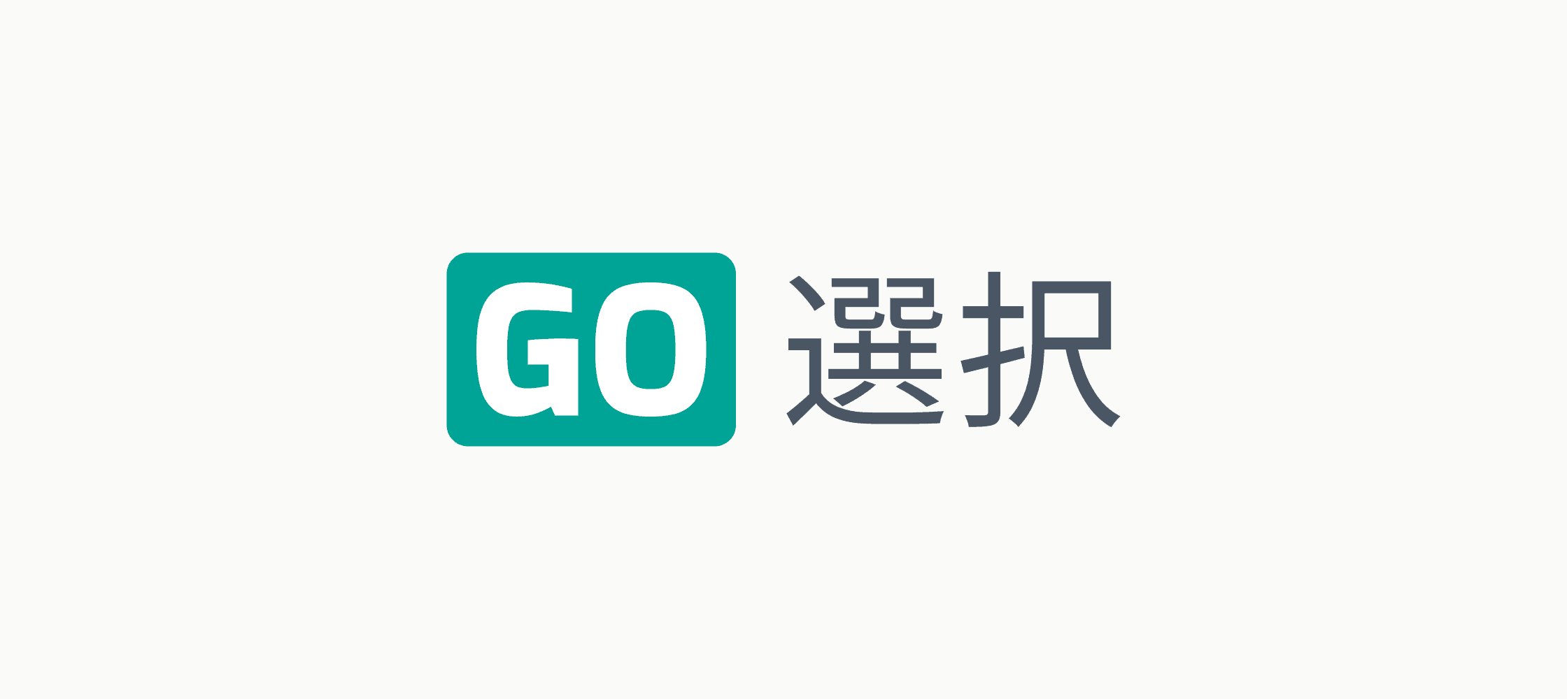
The new domain name is GoSentaku.com.
“Sentaku” means “choice” or “selection” in Japanese — clear, positive, and relevant. “Go” can be understood as either the number 5 or the English verb “go”, giving the name a dual meaning that perfectly fits the product’s concept.
As part of the branding process, we explored three logo directions:
*Japanese Fan – Featuring five blades, with the central, largest blade representing the top recommendation.
*Mountain Peak – Inspired by iconic Japanese mountains, symbolizing excellence and our mission to bring users “the top.”
*Bilingual Concept – Combining English and Japanese typography to reflect the dual meaning of the domain name and align with many competitors’ branding approaches. This design was ultimately selected, as it successfully balances cultural authenticity with global recognition.

03 UX Decisions
Key Features
After defining the essential features needed to deliver value to Japanese users, we began by shaping the product experience and functionality before moving into visual design.
*Ranking First – Placed the product ranking number as the most prominent element on the card, reflecting its importance to Japanese shoppers.
*More Info Button – Provided immediate access to detailed product information to support confident decision-making.
*Multiple Store Listings – Enabled comparison across different retailers for the same product.
*Festive Discounts – Used red for promotional tags to create a celebratory feel.
*Primary CTA – Designed a clear but non-aggressive call-to-action button.
*Added well-organized categories for intuitive navigation and faster product discovery.
*Maintained content richness while ensuring a logical visual hierarchy.

04 UI Design
Designing for the Japanese Users
We selected a turquoise-green primary color - calm and trustworthy yet visible enough to drive engagement — paired with gold as a secondary color to communicate premium quality. For promotions and discounts, we used red, aligning with Japanese cultural associations of festivity and excitement.

For more work


noyadani3010@gmail.com