Personalized Comparison Website
Best
Product Design | 2025

Background
Exon operates several successful products in the e-commerce and product-comparison space, each with clear boundaries and a defined structure. While these products provide strong value, they are limited in scope and flexibility. To expand beyond these constraints, we set out to create a new product that breaks those boundaries and helps users make smarter, personalized purchasing decisions. Instead of showing only a fixed list of products, we wanted to present a broader, richer view - one that adapts to different user needs and offers all relevant information in one place.
The Problem
The Mission
Work Process
In this project, my focus was primarily on designing the internal pages of the website.
Unlike our previous products - where the focus was placed almost entirely on product pages - this time it was essential for us to build a brand-driven experience. That meant treating the internal pages not as supporting screens, but as core parts of the product identity.
Research
Competitive Research
I began with an in-depth competitor analysis to understand what other major players offer: content structure, page length, recurring sections, comparison logic, and the overall tone of their websites. This helped identify gaps and opportunities for differentiation.

Research
Data & User Understanding
We conducted user interviews with existing Exon users to understand what they felt was missing in our current products.
Key insight: users want to feel confident in their decision. To achieve this, they need: clarity about who stands behind the website, transparent information, simple language, and a complete, trustworthy overview of the product.
Data analysis revealed that our internal pages weren’t generating enough outbound traffic. This reinforced the need to add multiple exit points to shopping sites, product pages, and related categories - to increase engagement and improve conversions.
UX Decisions
Structure & Wireframing
After combining insights from the market, users, and data research, I created the initial wireframes.
To accelerate the workflow and reduce future iteration cycles, I used AI to generate a visual starting point based on my wireframes and strategic guidelines. This helped align expectations early with the product manager and reduce the back-and-forth.
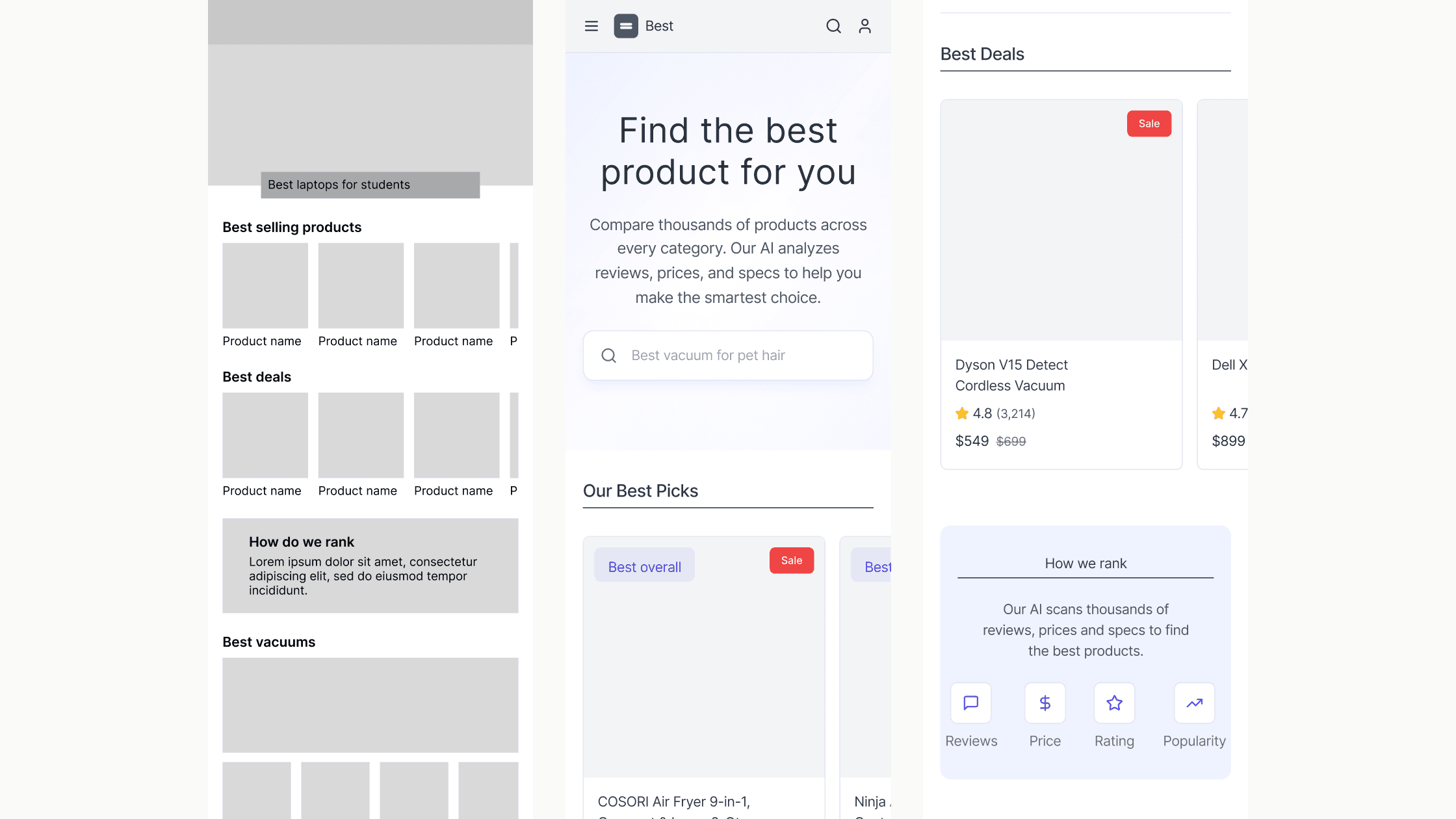
UI Design
Home Page
Once wireframes were approved, I moved into full UI design. In parallel, I developed a new design system for this product, built on top of Exon’s design guidelines but adapted for the expanded structure and flexible logic of the new experience.
The home page was completely restructured to become a high-value entry point rather than a simple navigation screen. I introduced multiple product exit points directly from the homepage to increase conversion opportunities from the very first interaction. Alongside these, I added several new content sections that clearly communicate the brand’s purpose, our selection methodology, and the credibility behind our recommendations. Each of these sections includes a direct link to the About page, creating a smoother narrative flow and helping users engage more deeply with the product and the company behind it.

UI Design
About Page
The About page was expanded into a meaningful storytelling hub that explains who are we and how we choose the products we recommend. I created structured, transparent explanations of our process while adding outbound links to relevant product pages to drive traffic strategically across the site. This page also introduces our unique personalized tag system, helping users understand exactly which products fit their lifestyle, needs, or constraints.

Final Result
The outcome is a new, flexible comparison product that breaks free from the limitations of Axon’s previous offerings. It provides richer content, deeper personalization, clearer explanations, and significantly more exit points — ultimately strengthening user trust, engagement, and decision-making. The project is currently entering development, and it is expected to become the company’s flagship product, with the potential to achieve record-breaking revenue once launched.

For more work


noyadani3010@gmail.com