Ecommerce Website Design System
Top 10
Product Design | 2025

Background
Top10 – Best Product Reviews is one of Exon’s flagship products: a global e-commerce website that helps users compare and evaluate top-rated products in a wide range of categories – from tech gadgets to home appliances and beyond. The website’s goal is to provide users with the insights they need to make confident, well-informed purchasing decisions.
As the product grew, so did its complexity. Top10 now operates globally across the United States, Europe, and Asia, with localized versions that adapt to language, layout, and regional product availability. The growing scope of the site introduced new UX and UI challenges — including maintaining consistency across different markets and ensuring scalability in both design and development.
This shift highlighted the need for a scalable, well-documented design system that would streamline collaboration between design and development teams, increase speed and efficiency, and ensure a cohesive user experience across all countries and devices.
The Problem
The Mission
Work Process
We began with the US site, as it is the largest and most central version of the product.
*Foundation – We first defined the core system: typography, color palette, spacing, grids, and layout structure.
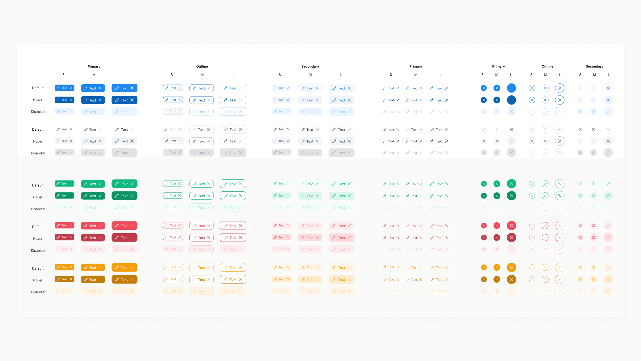
*Atomic Elements – Next, we created foundational components like buttons, inputs, and icons that would form the building blocks of more complex UI components.
*Component Library – Finally, we assembled complete components and templates to be used across all pages of the product.
*Localization & Adaptation – We then implemented smart variables to support multiple languages and visual adjustments across different regions, ensuring visual harmony and functional consistency across countries.
You can enjoy a quick teaser video of the final design system before diving in.
01 Foundation
Variables for Scalable Consistency
Due to the large scale of the product, we prioritized automations by building typography styles using variables, enabling quick switching between device sizes. Spacing was also defined with variables for consistent layout adjustments. For colors, we created a primitive containing all color palettes and tokens with precise assignments to elements, ensuring clear usage rules and consistent application across the product.


02 Atomic Elements
Building Blocks for Consistency and Efficiency
Atoms are the core of the design system. Our goal was to break down complex components into the smallest reusable parts to guarantee design consistency and efficient workflows. Every component is based on well-defined foundational guidelines, making them clear, scalable, and maintainable.
03 Component Library
Assembling the Product
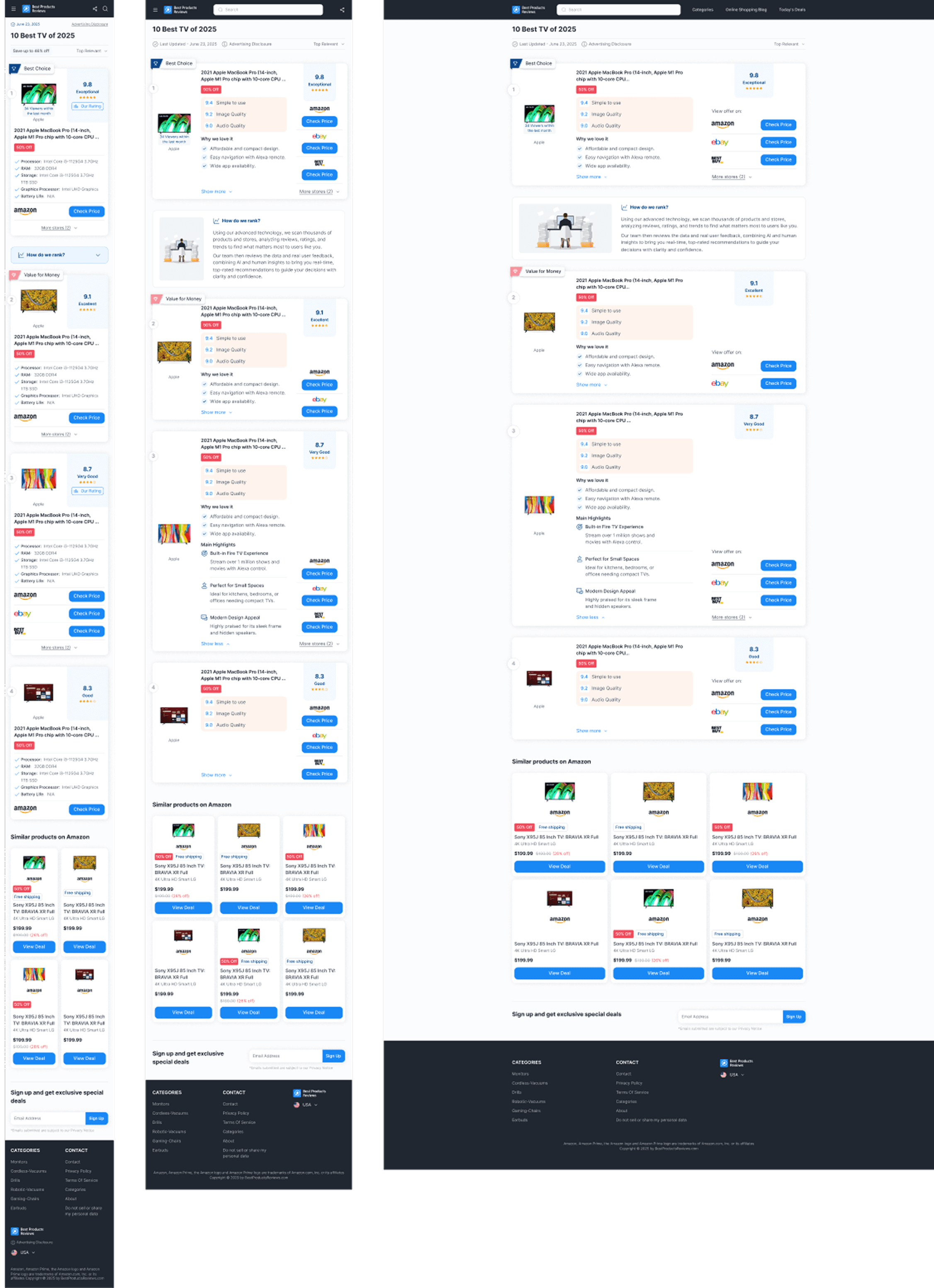
At this stage, we focused on building the complete set of components for the website and gradually assembling pages based on the established foundation. This approach promotes organized, efficient work and enables fast, precise updates and feature development.

04 Localization & Adaptation
Automated Language
The final step involved extending the system to support Exon’s global sites. We mapped all translations into variables for seamless language switching, and adapted components per country with different states—all grounded on the atomic foundation to ensure consistency across regions.

For more work


noyadani3010@gmail.com