Improvements Across Products

Selected e-commerce feature updates

Product Design | 2025-2026

Background

This project combines several small feature updates that I decided to present together. Each project highlighted a different challenge I had to tackle. Together, they contributed to the company’s growth, improved conversion rates across our websites, and enhanced the overall user experience.

01 Feature

Price History

One of our products is a price comparison website. The goal was to increase user engagement and provide additional value before making a purchase decision. We decided to add a price history feature.

The Challenge

The feature had to handle large volumes of products, which required careful planning for edge cases and ensuring reliable performance under high data load.

The Challenge

The feature had to handle large volumes of products, which required careful planning for edge cases and ensuring reliable performance under high data load.

The Outcome

The feature allowed users to make more informed decisions and increased time spent on the site, while maintaining stable performance even in extreme scenarios.

The Outcome

The feature allowed users to make more informed decisions and increased time spent on the site, while maintaining stable performance even in extreme scenarios.

02 Feature

New Box Layout

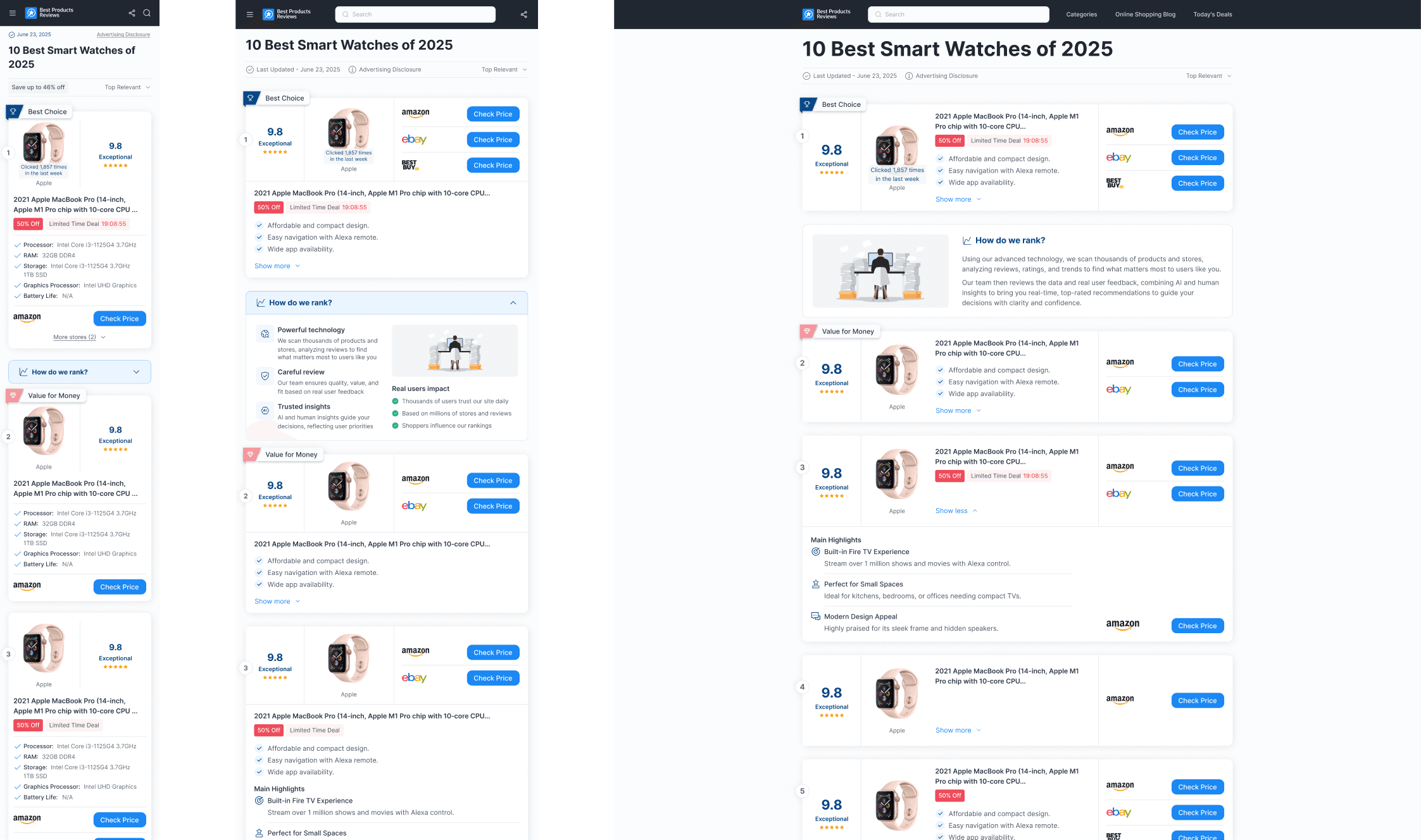
As part of our ongoing efforts to improve the user experience on our main comparison website, we decided to redesign one of the most important elements in the product journey: the product box. The existing layout had evolved over time and suffered from structural issues, including poor information hierarchy, inconsistent layouts, and CTA placements that didn’t fully support user behavior.
The Challenge

The goal was to create a cleaner and more scalable layout while preserving the rich product information users rely on. We needed to improve visual hierarchy, increase CTA visibility, and reduce cognitive load without removing valuable content. Additionally, the new design had to align with our development architecture, allowing components to adapt dynamically while maintaining consistency across thousands of products with constantly changing data.

The Challenge

The goal was to create a cleaner and more scalable layout while preserving the rich product information users rely on. We needed to improve visual hierarchy, increase CTA visibility, and reduce cognitive load without removing valuable content. Additionally, the new design had to align with our development architecture, allowing components to adapt dynamically while maintaining consistency across thousands of products with constantly changing data.

The Outcome

The redesigned product card introduced a more structured and unified layout, making information easier to scan and compare. Visual clutter was significantly reduced, while primary actions became more prominent and accessible. The new architecture also improved consistency across the platform and created a stronger foundation for future iterations.

The Outcome

The redesigned product card introduced a more structured and unified layout, making information easier to scan and compare. Visual clutter was significantly reduced, while primary actions became more prominent and accessible. The new architecture also improved consistency across the platform and created a stronger foundation for future iterations.

Data Impact

The redesign was launched as an A/B test and delivered positive results across both desktop and mobile. The new layout increased outbound clicks by approximately 3–4%, leading us to adopt it as the new default experience.

Data Impact

The redesign was launched as an A/B test and delivered positive results across both desktop and mobile. The new layout increased outbound clicks by approximately 3–4%, leading us to adopt it as the new default experience.

03 Feature

Limited Time Deal

We introduced a “Limited Time Deal” badge to the main Top 10 product cards. The badge appears when a product has a time-limited promotion on Amazon, helping users quickly identify deals that are currently active. In addition, during the final 24 hours of the promotion, a countdown timer is added to the badge to emphasize the urgency and signal that the deal is about to end.

The Challenge

The main challenge was integrating an additional badge into an already dense product card. The goal was to communicate more value without creating visual overload or increasing the card size- ensuring the CTA button remained above the fold.

The Challenge

The main challenge was integrating an additional badge into an already dense product card. The goal was to communicate more value without creating visual overload or increasing the card size- ensuring the CTA button remained above the fold.

The Outcome

The new badge was successfully implemented across two new US domains and later expanded to our European domains, becoming part of the product card’s design system.

The Outcome

The new badge was successfully implemented across two new US domains and later expanded to our European domains, becoming part of the product card’s design system.

Data Impact

Testing showed a clear improvement in performance. The version with the Limited Time Deal badge increased outbound clicks by roughly 2–3.5% and improved conversion rates, with some desktop scenarios showing up to ~8% higher CR, confirming that the added urgency positively influenced user behavior.

Data Impact

Testing showed a clear improvement in performance. The version with the Limited Time Deal badge increased outbound clicks by roughly 2–3.5% and improved conversion rates, with some desktop scenarios showing up to ~8% higher CR, confirming that the added urgency positively influenced user behavior.

04 Feature

Watcher Feature and Variants

This project focused on enriching product cards by introducing product variant information directly within the Top 10 comparison experience. The goal was to provide users with greater product visibility while encouraging deeper engagement and exploration of alternative options such as different colors, sizes, or configurations.

The Challenge

The primary challenge was finding space for the new information without increasing the size of the product card. Maintaining the existing layout was critical for both usability and business performance. At the same time, we wanted to improve the visibility of our Voucher feature and strengthen the connection between product discovery and purchase intent.

The Challenge

The primary challenge was finding space for the new information without increasing the size of the product card. Maintaining the existing layout was critical for both usability and business performance. At the same time, we wanted to improve the visibility of our Voucher feature and strengthen the connection between product discovery and purchase intent.

The Outcome

To accommodate variants without increasing the card height, I introduced different solutions across devices. On mobile and tablet, variants were positioned directly below the product image, creating a natural association with additional colors, sizes, and options. On desktop, where more space was available, variants were displayed as a dedicated row within the card. The Voucher feature was also redesigned and repositioned closer to the store section, making it more visible and action-oriented. The result was a richer product experience that provides additional context while encouraging exploration and purchase consideration.

The Outcome

To accommodate variants without increasing the card height, I introduced different solutions across devices. On mobile and tablet, variants were positioned directly below the product image, creating a natural association with additional colors, sizes, and options. On desktop, where more space was available, variants were displayed as a dedicated row within the card. The Voucher feature was also redesigned and repositioned closer to the store section, making it more visible and action-oriented. The result was a richer product experience that provides additional context while encouraging exploration and purchase consideration.

05 Project

Holiday Seasons

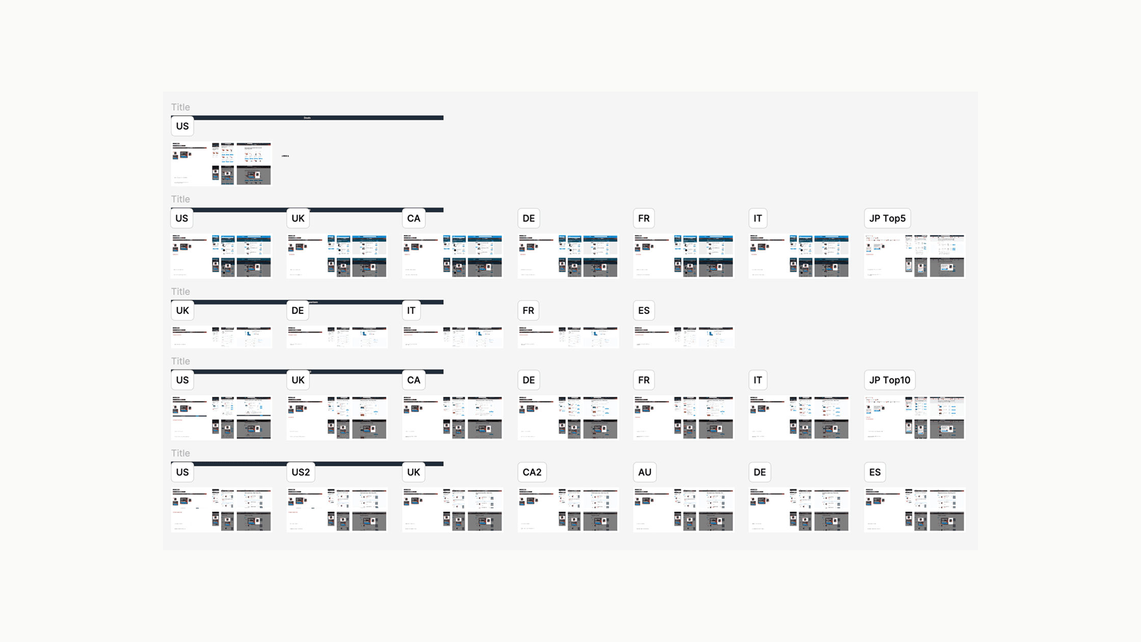
This project focused primarily on management and coordination rather than pure design. It covered four different holidays across nearly 100 domains.
The Challenge

*Planning and organizing the workflow.
*Creating a main component for each holiday, while aligning designs across multiple domains.
*Preparing mockups for each domain, highlighting key design points, including translations and adjustments.
*Developing comprehensive documentation to ensure smooth handoff and implementation.

The Challenge

*Planning and organizing the workflow.
*Creating a main component for each holiday, while aligning designs across multiple domains.
*Preparing mockups for each domain, highlighting key design points, including translations and adjustments.
*Developing comprehensive documentation to ensure smooth handoff and implementation.

The Outcome

The organized workflow and detailed documentation allowed different teams to execute updates efficiently and consistently, ensuring a high-quality user experience across all domains.

The Outcome

The organized workflow and detailed documentation allowed different teams to execute updates efficiently and consistently, ensuring a high-quality user experience across all domains.

06 Product

New Blog Experience

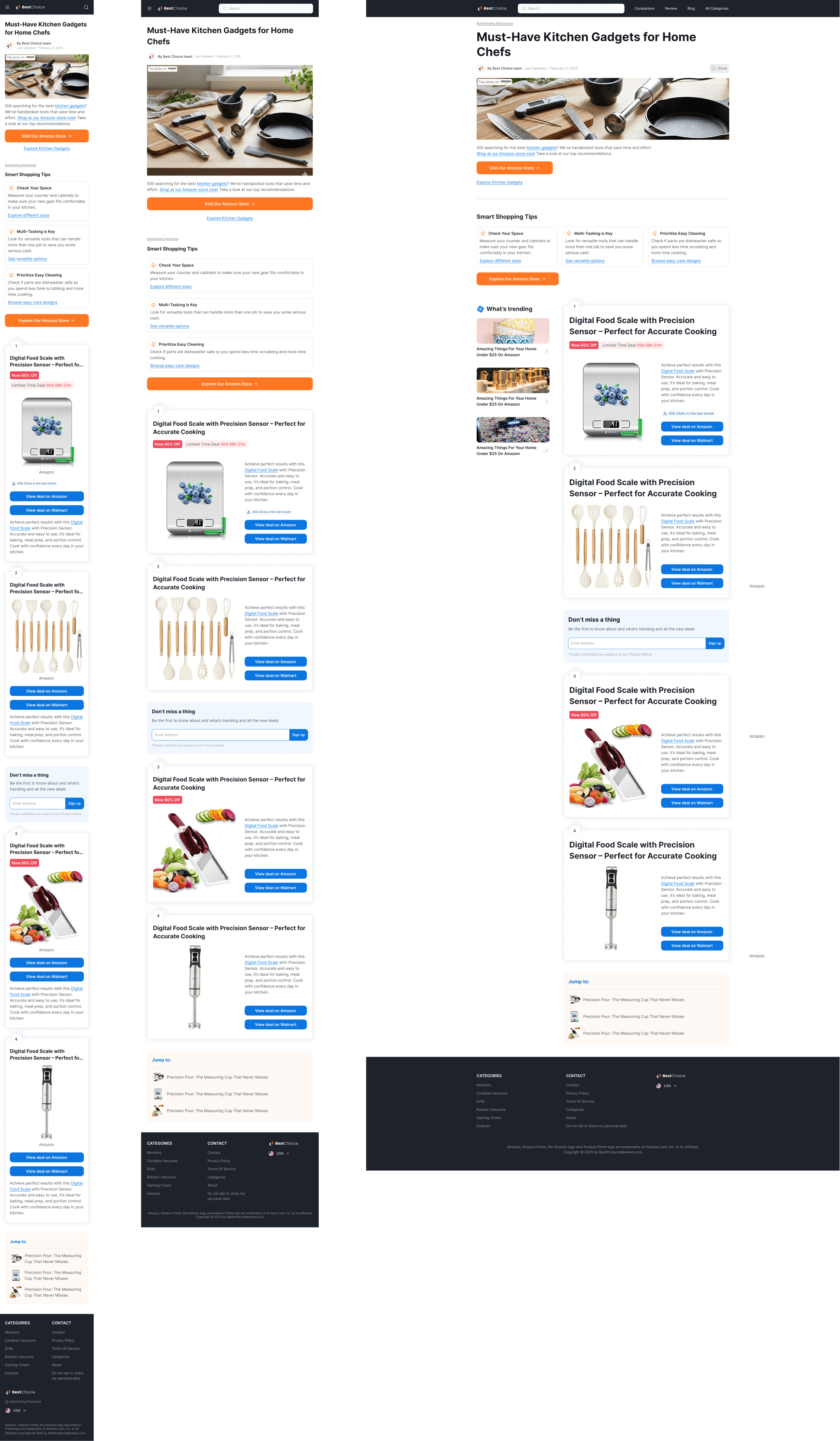
We redesigned the experience of one of our blog-based recommendation domains. Previously, users landed on a redirect-style landing page that quickly sent them to Amazon. While this approach drove fast outbound traffic, it didn’t provide much value or context for the users. The goal of this project was to connect the blog content with the redirect experience, creating a richer user journey that still supports quick purchase intent.
The Challenge

The main challenge was balancing immediacy with content depth, especially on mobile. We wanted to preserve the feeling of a quick redirect- keeping the main action above the fold, while still allowing users to scroll and explore the blog content and additional product recommendations without losing the primary purchase flow.

The Challenge

The main challenge was balancing immediacy with content depth, especially on mobile. We wanted to preserve the feeling of a quick redirect- keeping the main action above the fold, while still allowing users to scroll and explore the blog content and additional product recommendations without losing the primary purchase flow.

The Outcome

The new experience combines a strong redirect entry point with a richer blog environment. We introduced updated visuals, a clearer headline, and a short introductory paragraph that guides users to the Amazon storefront. At the same time, users who choose to scroll can now explore the blog content and product recommendations, creating a more valuable and engaging experience overall.

The Outcome

The new experience combines a strong redirect entry point with a richer blog environment. We introduced updated visuals, a clearer headline, and a short introductory paragraph that guides users to the Amazon storefront. At the same time, users who choose to scroll can now explore the blog content and product recommendations, creating a more valuable and engaging experience overall.

For more work

Ecommerce Website Design System

Top10

Product Design | 2025

Personalized Comparison Website

Best

Product Design | 2025

noyadani3010@gmail.com